Case Study
Tackling a 45% Basket Abandonment Rate
Tackling a 45% Basket Abandonment Rate
I spotted an opportunity, quantified it, built the business case, and designed a solution grounded in research.
I spotted an opportunity, quantified it, built the business case, and designed a solution grounded in research.
ROLE
UX Designer
SCOPE
Baymard audit, competitor analysis, user research
TIMELINE
2 months

01 / THE PROBLEM
Almost Half of Baskets Never Reach Checkout
In October 2025, 268,614 customers viewed their basket. Almost 120,000 of them left without clicking checkout. Only 8.79% returned organically to complete their purchase.
These aren't window shoppers. They've already decided to buy. They've found products, added them to their basket. Something at this final stage is stopping them.
44.6% Left without clicking checkout
8.79% Returned organically
109k Unclaimed baskets per month
The insight that made this clear
First-time visitors abandon at 35%. Returning users, people who know the site and trust the brand, abandon at 48%. That's a 37% higher abandonment rate for experienced users. When your most familiar customers struggle more than newcomers, the problem isn't trust or product selection. It's the experience itself.
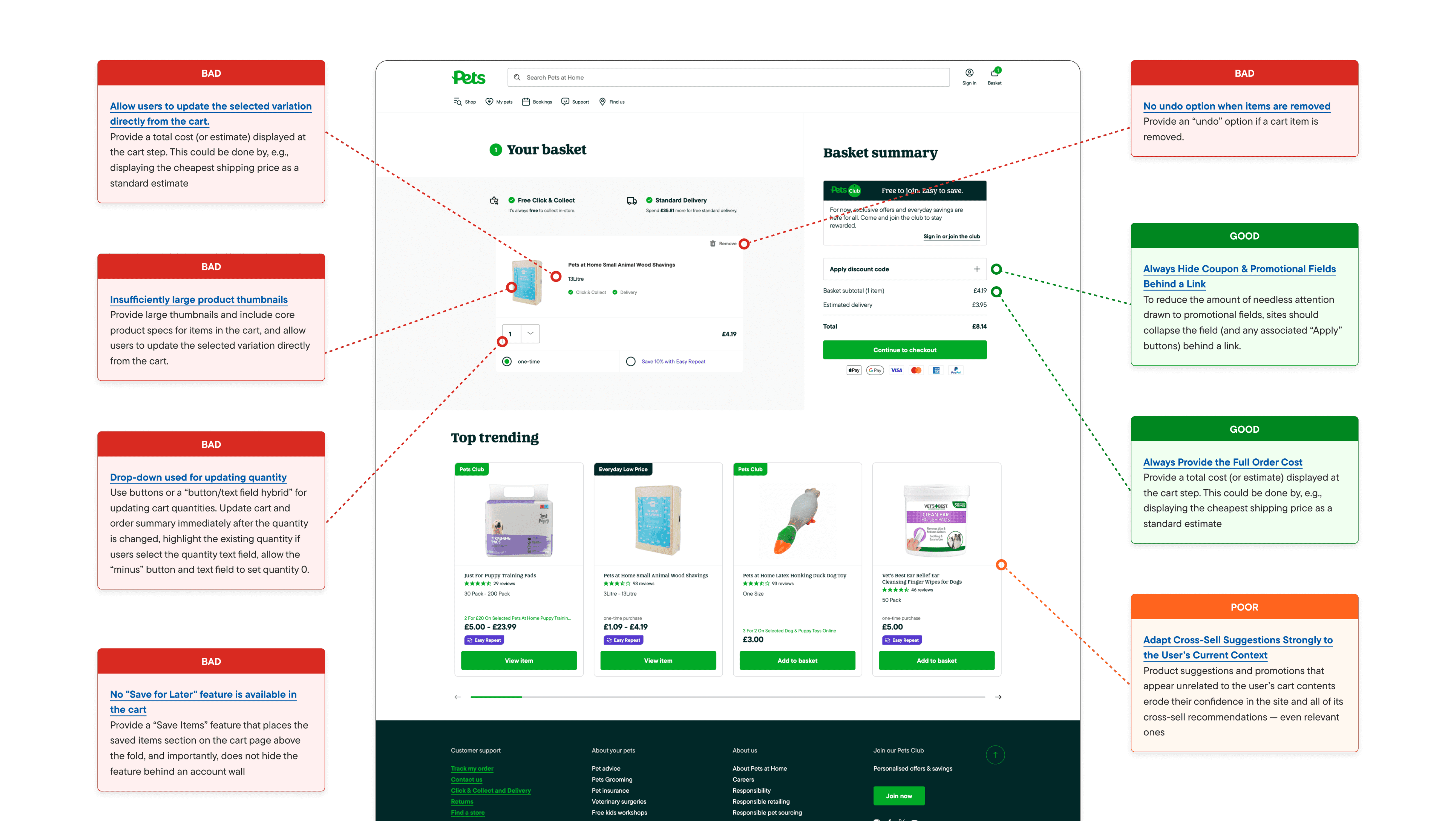
02 / THE QUESTION
Failing Baseline E-commerce Standards
I audited the current basket against Baymard Institute guidelines. The result: 6 high-impact violations and only 2 areas meeting best practice.
02 / THE QUESTION
Failing Baseline E-commerce Standards
I audited the current basket against Baymard Institute guidelines. The result: 6 high-impact violations and only 2 areas meeting best practice.
03 / RESEARCH
Building the Case With Evidence
The Baymard audit showed we were failing standards. But I needed to understand how users actually think about the basket and what competitors were doing. I ran three additional research streams.
Competitor Analysis
16 pet retail sites analysed against 11 UX criteria. Built a tool with Claude Code to automate the process. What would have taken weeks took days.
Feature Importance Rankings
Asked users to rank 10 basket features by importance. Checkout CTA and Basket Totals ranked #1 and #2. Neither is prominent above the fold on our current page.
Card Sorting
Tested how users naturally group basket features. No two participants organised them the same way, revealing fundamental information architecture problems.
Key finding from competitor analysis
Subscription options are absent from 60% of competitors. Express checkout options and delivery timing information are also weak across the market. These are opportunities to differentiate, not just catch up.
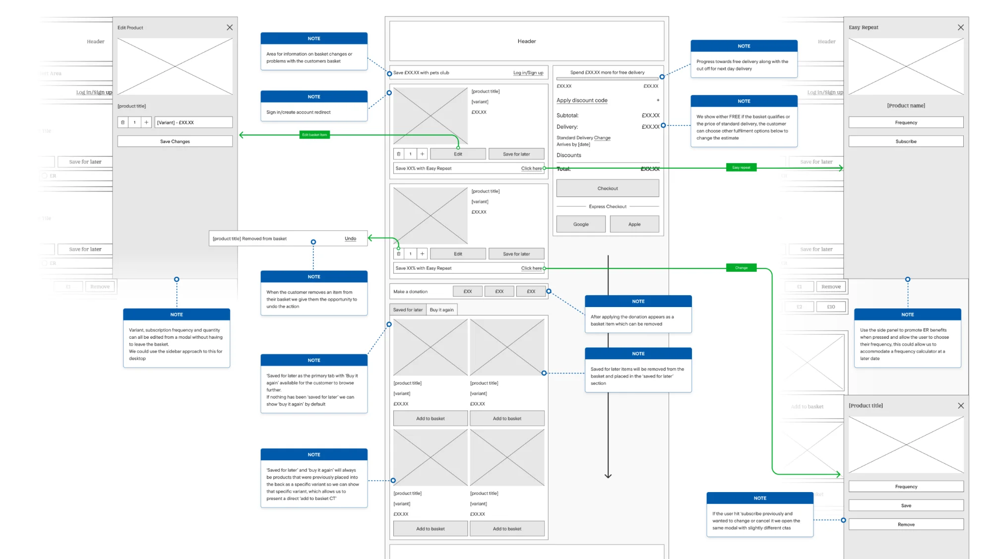
04 / THE APPROACH
Every Change Traced to Evidence
This isn't a redesign for redesign's sake. Every change in the prototype relates directly to Baymard best practices, competitor analysis findings, or user research. Engineering was involved from the start to ensure feasibility.
Wireframes → Lo-fi Prototype → User Testing → Hi-fi Prototype
I started with 4-6 basic wireframes focused on information architecture before moving to interactions. The wireframes were built with detailed annotations explaining the rationale for each decision.
05 / USER FEEDBACK
Testing With Real Users
The lo-fi prototype was tested on usertesting.com and internally. The feedback validated the approach and highlighted areas for refinement.
"It's the sort of checkout, website checkout thing I would be pleased to use because it's just very intuitive."
"I really like the option to edit the product and change the size from within the basket rather than having to go out and find the product again."
"From an end user perspective, it was really simple. It was really effective."
"I was really impressed with sort of being able to add the delivery choices that you wanted. It reflected it all on the system and updated accordingly."
Actionable feedback
One user noted that "Save" as a label was unclear: "I wouldn't really know that would be to take the product away. Maybe if there was a clearer way of saying that with sort of language." This kind of feedback drives iteration.
06 / THE PROTOTYPE
A Testable Product, Not Just a Mockup
The hi-fi prototype isn't a static design. It's a fully functional, accessible React build with real interactions and configurable variants for A/B testing different approaches.
Full checkout flow
Save for later
Subscription setup
Delivery method selection
Variant/quantity editing
Free delivery progress
Undo functionality
Fully responsive
Accessible
07 / WHAT'S NEXT
Testing and Phased Implementation
The next step is user testing on the hi-fi prototype, followed by building an implementation roadmap. This won't ship all at once. It will be integrated piece by piece, with each change measured for impact.
The fix for basket persistence
The technical issue that started this investigation, basket persistence across sessions, is now in development. This paves the way for the abandoned basket email that originally surfaced the problem.
08 / THE OPPORTUNITY
What This Could Mean
£57M in abandoned baskets annually
Even a modest 2% improvement = £2.81M in annual revenue
5,372 additional monthly conversions
These are customers who've already decided to buy. The opportunity isn't about attracting new visitors. It's about removing friction for people who are ready to purchase.